Tuesday, June 30, 2009

Dave Churchman's House o' Letterpress

Fresh back from Indianapolis with a pile of letterpress supplies. We loaded up with a couple cases of lead type (36pt Airport and 36pt P.T. Barnum); 2 fonts of wood type (8 line Futura and 8 line French Clarendon Condensed), both all caps with figures; various cuts and tons of dingbats; a furniture cabinet; paper, tympan, pressboard, and a few blank type cases for the cabinet*. More pics of Dave's place in a later post. For now, onto finding a home for the new arrivals!

* This leaves us with a surplus of type cases (the divided drawers used for holding type). If you are interested in them, let us know.

Monday, June 29, 2009

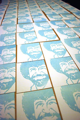
APA preview: Trees are our friends

A pearl of wisdom from the master of the fanbrush.

Paper is Crane Lettra (110#, pearl white); type is handset lead; image is lino cut; 3.67" x 4.25"

Saturday, June 27, 2009

Shop Music: Johnny Cash

This series celebrates what we're playing while we're printing.

You pretty much can't go wrong with any offering from Johnny Cash, but our current favorite is American III: Solitary Man. Recorded after his health started to wane, Solitary Man offers sparse and tender performances by Cash. On each track he confronts his physical frailty with an enduring resilience, producing an rather inspiring album. A highlight for us is June Carter Cash joining him for a beautiful rendition of "Field of Diamonds." It's a nice bookend to their earlier animated collaborations such as "Jackson," and a gleaming reminder of the inevitable passage of time.

Samples can be heard here.

Friday, June 26, 2009

Road Trip

Duckpin is off to see Dave Churchman in Indianapolis this weekend. Hopefully the Beetle will be pushing its way back on I-70 overflowing with all sorts of letterpress goodies.

Wednesday, June 24, 2009

APA June Bundle, part 2


A good letterpress shop has a small selection of fancy initial caps to choose from when setting text. By this measure, Arlene Popkin and Stephen Hirshberg's Thomas Jefferson Press is a great shop. Their offering in the June APA bundle showcases 26 different decorative capitals, from A to Z. Each capital kicks off a passage from a famous literary work, so not only is their booklet a pleasure for the eyes, but it provides satisfaction for the soul. Above is the cover and two examples of the beautifully set pages, with excerpts from Ulysses (S) and Zip-A-Dee-Doo-Dah (Z).

Printed on a 1908 7x11 Golding Improved Pearl. Edition: 200.

Sunday, June 21, 2009

APA June Bundle, part 1

Couple of nice pieces in the June APA bundle. The wedding invite on the left features almost a dozen different fonts. What could be a design disaster in the making instead is deftly executed, as the fonts hang together in a surprisingly cohesive way. The monochromatic printing no doubt helps this, but you gotta appreciate the risk taken in using such a wide array of faces and making it work. All in all a fun little invite.

On the right is a rather simple one-color bookmark from Gary Hidden that makes great use of a tropical cut. The elongated palm tree scene feels right at home on the 7 inch tall bright-orange paper -- perfect for finding what page you left off on. It will be finding a home in my summer reading: The Dord, the Diglot, and an Avocado or Two: The Hidden Lives and Strange Origins of Common and Not-So-Common Words.

Thursday, June 18, 2009

Type

Web Urbanist is a great site devoted to exploring art, architecture, and design. They occasionally dip into graphic design, including this post devoted to modern typographic art. Above is a design by Steve Yee of Chiat/Day. Radiohead fans will recognize the words as song titles favored by Thom Yorke, who is pictured. There are 14 more pieces of equally impressive type design in the post.

Monday, June 15, 2009

20 Years of Valvoline Paint Schemes

Some of the top drivers in NASCAR have run with Valvoline on their hoods. The oil maker has been a stalwart sponsor since NASCAR's early days. (Fun fact: Valvoline was in the winning car in the first American car race back in 1895.) But over the past 20 years, their paint schemes just haven't kept up with their preeminence in racing.

Neil Bonnet's 1989 scheme (top left) features a bold V stretching across the hood with "Valvoline" set in all caps. The logo and name sit atop the a body, with the back of the car featuring the name knocked out of a dark background. This was iconic design visible at high speeds, and set the style that would define their look for the next 15 years. Mark Martin's scheme from '93 (top right) continues the tradition, but with Valvoline set in upper- and lower-case. The car number on the door now falls on the dark background. The next paint job (middle left) is my favorite of all the Valvoline schemes, with the V transcending its role of simple logo to become a forceful design element. The V allows the car to retain it's earlier characteristics of light front/dark rear and allows for instant recognition on the track. Mark Martin wheeled this scheme into Victory Lane four times during the 1995 campaign.

In 2002 Johnny Benson sat behind the wheel of the #10 (middle right) with its much-neutered design. The earlier precedents are retained, but handled poorly. The swoops along the side and the smaller V on the hood detract from the overall impact. The incredible shrinking hood logo continues in the bottom row (2008 and 2009), with Valvoline's presence on the hood diminishing with each iteration. At this rate, A.J. Allmendinger's signature above the door will be larger than the logo on his hood. Also lost is the light front/dark rear concept that had long been part of the car's identity. This year's design looks like they just plain forgot to paint the sides of the car.

When companies are paying upwards of $20 million a year to carry their message on the hood of front-running car, you have to take full advantage of the space you have. We happen to think Valvoline's dropping the ball here. Duckpin would be happy to step in and sponsor the car instead.

Anyone have $20 million they'd like to part with?

Saturday, June 13, 2009

Monday, June 8, 2009

More Poop Rainbows

Don't adjust your color settings. Today's post is brought to you in all its technovomit -colored glory.

A trip up to the Laurel Am-Vets thrift store yielded this cache of kaleidoscopic color. (That is, if your kaleidoscope is stuck on yellow, orange, and brown.) Enjoy our latest installment of poop rainbows, clockwise from top left:

• How to cook food in that newfangled "microwave"
• A gradient rainbow t-shirt
• Andy Williams' The Shadow of Your Smile. Note: If your teeth are a bleached as his, there is no shadow
• Starter kit for your Weber Grill
• If there was ever a typeface that captured the zeitgeist of the poop rainbow, this Perry Como album has it: Cooper Black
• This Kenny Rogers shirt is actually an earlier thrift gift from Jim L., but I have to credit our good fortunes to wearing it on our outing. As any rainbow chaser will tell you: poop rainbows beget poop rainbows

Click on image for larger view.

Saturday, June 6, 2009

Coin-Op Studio

Arriving in the mail this week was a wonderful piece of letterpress from illustrator Peter Hoey. The letter-sized promo is most striking for it's extreme level of detail. Captured here a couple of close-ups showing the precision required to pull off an even printing of such closely-spaced wavy lines, especially on the pillowy Lettra stock. All around, a well designed and well executed piece. Now excuse me while I wipe the drool and jealously from my face.

Plates are photopolymer from Boxcar; printed on a Vandercook SP-15; Crane Lettra

Wednesday, June 3, 2009

Master of the Fanbrush

When it comes to American painters, there is no artist quite like Bob Ross. His everpresence on PBS is testimony to his innovative techniques, his encouraging tone, and his ability to mesmerize viewers with a soft-spoken, reassuring voice. Sure, his canvases sometimes looked like the cousins of Thomas Kinkade's sappy works, but it was his philosophy that was his strength. Bob taught us that we may not have power over our everyday lives, but we are the sole determiners of what goes on in our artwork. He let us know that we are the creators of our own little worlds, and through our own creations we can experience unbridled joy.

We certainly experienced that when creating these poster tributes to him.

Paper is from the French Paper Company; assorted wood and metal type, metal stars, arrows and rules; handcut lino block; hand inked in 3 passes on the cylinder press. 12.5" x 19". Thanks to Mom and Dad M. for their assistance. Special thanks to WHUT for continuing to air episodes of the Joy of Painting daily.

Monday, June 1, 2009

More Handlettering

Our earlier hand lettering post displayed a more traditional version of the art form. Above is a contemporary work by San Francisco-based artist Jeff Canham. He's keeping the ol' art form alive with a tangy design sense and flawless execution. Now if we only could get a handpainted Duckpin sign to hang in the basement...