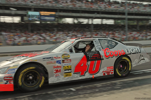
Showing posts with label NASCAR. Show all posts

Saturday, February 9, 2013

2013 Paint Schemes

With the Daytona 500 just around the corner, we've been eagerly watching as each teams' paint schemes are unveiled for the upcoming NASCAR season. With marquee sponsors paying as much as $20 million a year to sponsor a ride, a lot of effort is put into each design. Longtime readers of this blog will know that we've shared some of our favorite paint schemes in past posts.

So far, Richard Childress Racing will be sporting a pair of the sharpest schemes this year. Austin Dillon will kick off the season with a Daytona paint scheme featuring Honey Nut Cheerios, and Jeff Burton will run six races with regular ol' Cheerios on the hood:


Do you have a favorite of the two?

Personally, we still have a soft spot for our previous favorite Cheerios paint job, seen here on Johnny Benson's '98 Taurus:

Thursday, October 11, 2012

Wildwood


Duckpin's apprentice-for-life, Christine, just returned from Wildwood, New Jersey. She was there as part of the Society for Commercial Archeology's "Wildwood Daze" conference. (Christine moonlights as a preservationist when she's not slinging ink.) According to their mission statement, SCA is "the nation’s oldest organization devoted to the buildings, artifacts, structures, signs, and symbols of the 20th-century commercial landscape. The SCA recognizes the historical significance the automobile has had in shaping our landscape and culture."  

Christine was there to present her paper “A Need for Speed: The Cultural Landscape of Stock Car Racetracks” which examines the impact of race car culture on the built environment. But more importantly, she was there to tour the Wildwoods. While there, she captured some great signage from this mecca of Doo-Wop design. We'll be using it as inspiration in upcoming projects. Hope you can, too.

Click on images for the wicked big size

Monday, May 16, 2011

Patriot Paint

Ever wonder what it would look like if Uncle Sam threw up on your car?

Fans can now choose from three potential paint schemes for Kevin Harvick's Budweiser Chevrolet, two of which are pictured above. The winning design will run at Daytona over the July 4th holiday weekend. While the summer Daytona race has always had a dose of Independence Day fever -- from the '60s through the end of the '80s it was known as the Firecracker 400 -- has there ever been a paint scheme that has been so yea-rah-rah America?

Perhaps not. But don't let that stop you from trying to top it. Now's your chance to create one even more Americantastic! The Toyota Sponsafier is back, allowing you to design your own paint scheme from scratch! And what can be more American than slapping your red-white-and-blue on the side of a Japanese car?

Friday, March 18, 2011

The Bullring

NASCAR rolls into Bristol this week, in what is one of the most entertaining tracks on the circuit. The high-banked, 1/2 mile oval always makes for tight racing and hot tempers.

This week Denny Hamlin will be running his FedEx Express paint scheme, one of four schemes he normally runs for FedEx. Given my penchant for orange, I'd say it's the baddest ass one of them all. Since Denny joined Gibbs racing, the one constant has been FedEx on his hood. But the paint schemes have changed throughout the years. Here's a run down of the "Express" schemes:

2011:


2010:
2008:

Have a favorite one? Put it in the comments below.


And now, for bonus paint scheme coverage from 2006:


This last one has got to be one of the most original paint schemes of the modern era. It ran at Atlanta to promote FedEx's sponsorship of the PGA Tour Fed-Ex Cup. Though it looks like they took a mallet to body work to give it its dimpled look, it's all an illusion done with paint and vinyl. NASCAR, meet trompe l'oeil. (I'm pretty sure this is the first time those two words have appeared in the same sentence.) Just imagine what they could do if a breast implant doctor ever sponsored a car...

Enjoy the race!

Thursday, July 8, 2010

Worst Paint Scheme Ever?

When Tony Stewart's crew pulls into Chicagoland Speedway this weekend, they'll be rolling off what has to be the ugliest car so far this year. Office Depot's "back to school" paint scheme looks like a kid who slipped on the way to school and accidentally emptied her backpack's contents all over the sidewalk. This technicolor hodge-podge of shapes and logos has no rhyme or reason, and will look even more ugly at 180 mph than it does standing still. I'd put it up against any of these other ugly schemes any day.

Is this the kind of design we want to be teaching our kids? Yeesh.

Saturday, June 12, 2010

The Duckpin Dueler

Our impending trip to Las Vegas always brings up the inevitable question: what would you do if you won a million dollars?

My answer is above.

Toyota's put together a great site where you can design your own racecar for the price of providing them a fake e-mail address. After you pimp it out, you can take it for a 3-D simulated test-drive, complete with burnouts. It's a wonderful way to spend an hour or twelve. Kinda like dreaming about what you'd do if you won a million dollars.

Friday, April 23, 2010

Dega, Baby!

When the thunder rolls onto NASCAR's longest track this weekend, David Reutimann will be sporting a different, uh, sport on his hood. The Alabama college football champions will be featured on the double zero. Given Dega's history of spectacular crashes -- just ask Carl Edwards about his wild ride last year -- here's hoping the only Crimson Tide we see is Reutimann's paint scheme.

Wednesday, November 18, 2009

Post Number 100

We made it to the century mark! Boy, that's a lot of wasted time -- for both you and us. But we managed to learn a bunch, and hopefully you have, too. While we stuff our gourds with celebratory gluten-free cake, click on the links below to enjoy a recap of the highs and lows...

Who knew that poop rainbows were nature's way of saying, "blog about me!" We found a pot of gold at the end of that particular rainbow and determined once and for all the true master of the fanbrush. (One hint: it wasn't a man who looks like Kenny Rogers.) Speaking of man, human evolution provided a jumping off point for our look at patterns in modern poster design. But just so we didn't appear too erudite, there were plenty of visits with NASCAR paint schemes, including a post on the 200 mph history of Valvoline. In other sports news, we paid a visit to the curling sheet to see the latest in curling fashion. That may inspire a great gift idea for the little'un being feted in our favorite baby shower announcement. You can look here to see more announcements and other self-printed projects that we put on the blog over the past 100 posts. Enjoy!

Wednesday, November 4, 2009

100 to Go

In just 100 days, the Winter Olympics will officially open. Just two days later, NASCAR kicks off its season with the Daytona 500. At the intersection of the two will be Kasey Kahne. His Dodge will be mantled by a Team USA paint scheme at both Daytona and the following week in Fontana.

Perhaps Dale Jr. could be sponsored by alpine skiing... 'cause his career is going downhill fast.

Friday, July 10, 2009

The Silver Bullet Rides Again

No, it's not Sterling Marlin in the Coors car, but rather Carl Edwards' paint scheme for this weekend's race in Chicago. Great use of the annoying Aflac spokesduck on the side of the car, especially with the black stroke to set it off from the silver body. This baby should sparkle under the Saturday night lights. And for the sake of one Duckpin dad, let's hope Carl does, too.

Monday, June 15, 2009

20 Years of Valvoline Paint Schemes

Some of the top drivers in NASCAR have run with Valvoline on their hoods. The oil maker has been a stalwart sponsor since NASCAR's early days. (Fun fact: Valvoline was in the winning car in the first American car race back in 1895.) But over the past 20 years, their paint schemes just haven't kept up with their preeminence in racing.

Neil Bonnet's 1989 scheme (top left) features a bold V stretching across the hood with "Valvoline" set in all caps. The logo and name sit atop the a body, with the back of the car featuring the name knocked out of a dark background. This was iconic design visible at high speeds, and set the style that would define their look for the next 15 years. Mark Martin's scheme from '93 (top right) continues the tradition, but with Valvoline set in upper- and lower-case. The car number on the door now falls on the dark background. The next paint job (middle left) is my favorite of all the Valvoline schemes, with the V transcending its role of simple logo to become a forceful design element. The V allows the car to retain it's earlier characteristics of light front/dark rear and allows for instant recognition on the track. Mark Martin wheeled this scheme into Victory Lane four times during the 1995 campaign.

In 2002 Johnny Benson sat behind the wheel of the #10 (middle right) with its much-neutered design. The earlier precedents are retained, but handled poorly. The swoops along the side and the smaller V on the hood detract from the overall impact. The incredible shrinking hood logo continues in the bottom row (2008 and 2009), with Valvoline's presence on the hood diminishing with each iteration. At this rate, A.J. Allmendinger's signature above the door will be larger than the logo on his hood. Also lost is the light front/dark rear concept that had long been part of the car's identity. This year's design looks like they just plain forgot to paint the sides of the car.

When companies are paying upwards of $20 million a year to carry their message on the hood of front-running car, you have to take full advantage of the space you have. We happen to think Valvoline's dropping the ball here. Duckpin would be happy to step in and sponsor the car instead.

Anyone have $20 million they'd like to part with?

Wednesday, April 22, 2009

Tradin' Paint II

So while comparing Darrell Waltrip's paint schemes, I ran across a couple other gems worth sharing. Okay, I ran across a zillion worth sharing, but I'll spare everyone.

Talk about being true to your sport: what more perfect embodiment of NASCAR is there besides chew and brew? Behold two of the most iconic paint jobs in racing. "Handsome" Harry Gant steered his Skoal Bandit Chevy Monte Carlo (left) for over a decade in the Winston Cup series. Bobby Allison's 1988 Miller High Life scheme (right) literally glimmered with gold metallic paint. Yup, even them wheels.

Incidentally, you can thank ol' Bobby for the style of racing you'll see at Talladega this weekend. Twenty-two years ago Allison was involved in a crash at Talladega so horrific that NASCAR instituted the restrictor plate to reduce a car's top speed. Drivers could no longer travel at 200+ mph, but hey -- at least they could still enjoy some dip and a cold one!

Thursday, April 16, 2009

Boogity Boogity Boogity

As much of a goofball as you may think Darrell Waltrip is in the Fox booth, the guy was one hell of a driver -- and always entertaining. I remember watching him in Victory Lane at the 1989 Daytona 500 celebrating his win by doing the Icky Shuffle. His childlike exuberance was stunning, and was one of those moments when you realize that these guys really just want to have fun out there. But to have fun, you gotta have a sponsor painted on the hood. And car for car, I think Darrell had the best paint schemes out there.

The Pepsi Challenger Monte Carlo (top left) wasn't one of the best executed advertising jobs I've seen, but it's a good example of what was pretty much par for the course. For every iconic design (think Richard Petty's #43 STP), there were a dozen that we're lackluster. Compare that humdrum Monte Carlo to the Gatorade and Mountain Dew Buicks. Those paint schemes are classic, the white border perfectly framing the green fields. Those two cars scream speed just standing still, and yet were effective billboards at 180 mph. And I get thirsty just looking at them. (Nerd intermission: Note how the "88" retains its personality, yet is perfectly legible with those outsized counters -- important at top speed. Compare it to Dale, Jr.'s muddy 88. No way you're reading that when you're in the stands. You can do better than that, fellas.)

That 1989 Daytona 500 was the 17th attempt by Waltrip to win the Great American Race, and he did it in the #17. That car is known as the "Tide Ride," and for me is the best paint scheme ever to run. The car just glowed from its fluorescent paint job. You couldn't miss it on TV either, as it left long, orange contrails whenever it zoomed past the camera. Maybe it was just our crappy TV, but his Chevy looked like a comet streaking across the screen. That kind of cosmic speed would make me want to do the Icky Shuffle, too.