


Sixteen-line wood type and transparent ink

 Lame-o us.
 Our latest jaunt to the thrift store tapped that fertile color vein we call the Poop Rainbow™. On the left, Marco displays a dinner plate, while our own print devil models an afghan blanket on the right. Who needs Barker's Beauties when we have these two?
 While the phenomenon of the poop rainbow™ occupies waaaaay too much of our time, we never really paused to consider its origins. That is, until we saw this obituary in yesterday's Washington Post.
Some think that finding the origin of a rainbow leads to a pot of gold. In this case, it leads to the late Mr. Barnett. Thank you, sir, for introducing the poop rainbow™ to the Nation's Capital. You can rest easy knowing that others appreciate your legacy. And, thanks to you, we can rest easy in one of Metro's "Cleatuses."Mr. Barnett was a staunch defender of Metro's original orange, gold and brown interior hues. He had helped choose the color-combination and resisted efforts to change it, even when popular opinion deemed it an ugly throwback to bygone times.
Eventually, train chairs were upholstered in burgundy and blue. But in deference to Mr. Barnett, seats at the front and back of each car retained the old palette. The chairs are known as "Cleatuses."
 Duckpin Press' west coast correspondent brought to our attention a terrific collection of early 20th century photography. What's so special about it? It includes some of the only color photos of small-town, Depression-era America, courtesy of the Library of Congress' collection.
 It's summer -- time to get yourself a tankful of gas and a cooler full of sandwiches and hit the road. If you're not the chain hotel type, you might enjoy Motel Americana. You'll find a great trove of vintage postcards, including those above (click for larger view). Neon enthusiasts will love the dozens and dozens of motel sign photos as well. For those who can't resist the lure of the road, this should be your first rest stop.
 Recently we did a fun little project for Ilana Kohn, illustrator and clothing designer extraordinaire. The tag measures 1" x 2.5" (we weren't kidding when we said "little") and is blind embossed. We used Airport typeface set in 36pt lead on pearl white Lettra paper. Want your very own tag? You'll just have to buy a dress!
 The city of Austin has always been good to letterpress, and this holds true even in the digital age. The University of Texas at Austin has digitized its Rob Roy Kelly American Wood Type Collection. Besides images of the specimens, the site includes a great history of American type, profiles of different font families, and plenty of resources for further study. This is a true gem of an introduction to wood type.
 When Tony Stewart's crew pulls into Chicagoland Speedway this weekend, they'll be rolling off what has to be the ugliest car so far this year. Office Depot's "back to school" paint scheme looks like a kid who slipped on the way to school and accidentally emptied her backpack's contents all over the sidewalk. This technicolor hodge-podge of shapes and logos has no rhyme or reason, and will look even more ugly at 180 mph than it does standing still. I'd put it up against any of these other ugly schemes any day.
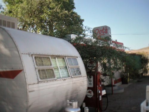 Two years ago, Duckpin spent the Fourth of July hopping around Southeast Arizona. One of the highlights of our stay at the Shady Dell RV park in Bisbee was our morning breakfast at Dot's Diner, the tiny greasy spoon pictured above.
 In an earlier post, we showcased a book that extols modern design created with age-old technology. Now, from our West Coast correspondent, James, comes word of the Alt1977 project. Alex Varanese has done the opposite: he celebrates today's technology through the lens of yesterday's design. His ads, two of which appear above, tout the power of recent technology to the technophiles of the late 1970s. More spectacular images here.
 We couldn't help but squeeze in some Indiana sightseeing on the way back from Dave Churchman's. Above are photos from the West Baden Springs Hotel just outside of French Lick. The gorgeous dome was the largest in the world at the time it was built. And for awhile there in the '80s and '90s, it looked like it was going to be unbuilt. After a long period of neglect, the hotel was saved from demolition and recently restored to it's former glory. Well worth the 300-mile detour.
 Our impending trip to Las Vegas always brings up the inevitable question: what would you do if you won a million dollars?
 After returning from a very fruitful trip to Dave Churchman's letterpress warehouse in Indianapolis, we're looking forward to putting our latest finds to work. We bought 6 or 7 fonts of wood type to fill out some missing areas of our collection, plus various lead slugs, rules, borders, etc. that would be too expensive to ship by mail. Kind as always, Dave threw in some extras to make the 1000-mile roundtrip journey well worth our while. But honestly, just seeing all the presses and parts in person is worth it; it's an education you won't find elsewhere.

 The new book Impressive explores the confluence of modern design and age-old production techniques (letterpress, hand-binding, block engraving, etc.). The desire for a handcrafted feel is the common thread among these projects. Though the techniques are traditional, the results are not. Impressive indeed.
 So whatever became of all those forms we saw in the previous post? After their printing they were likely sent to this room -- the bindery -- to be stitched and trimmed into a finished product.
 enlarged from top image
 We're fortunate to live so close to what was once the world's largest printing plant, the Government Printing Office. Being only a mile away from the facility, it would be an easy commute if, instead of being occasional practitioners, we toiled full-time in the Black Art. Perhaps it was this easy commute that appealed to previous occupants of our house. Several GPO printers have called our house home, starting just after the turn of the 20th century.
 enlarged from top image
 When reading up on one of my favorite comedians, I came across this little nugget on Henny Youngman via Wikipedia:
He grew up in New York City, and his career as a comedian began after he had worked for a number of years at a print shop, where he penned and published a large number of “comedy cards”—cards containing one-line gags that were sold at the shop. The comedy cards were discovered by up-and-coming professional comedian Milton Berle, who encouraged Youngman and formed a close working friendship with him.
 Mark your calendars for another inspiring auction of modernist posters. On May 3rd, Swann Galleries will be selling 177 lots of posters dating from the 1890s through the 2000s. Pictured is a collection of our favorites, including a clever and whimsical ad for yo-yos by Raymond Gig. We happen to think it would look fetching in the basement of Duckpin HQ. Hint, hint...
 When the thunder rolls onto NASCAR's longest track this weekend, David Reutimann will be sporting a different, uh, sport on his hood. The Alabama college football champions will be featured on the double zero. Given Dega's history of spectacular crashes -- just ask Carl Edwards about his wild ride last year -- here's hoping the only Crimson Tide we see is Reutimann's paint scheme.

