Saturday, August 8, 2009

Letterpress Playing Cards


There are a handful of activities tailor-made for the basement: tasteful boudoir photography, printing, and card playing. While he may not be able to help you with the first one, Stuart Bradley at Railway Station Press has produced a wonderful set of letterpress playing cards on his C&P tabletop Pilot. Aside from being a darn good printer (having been a student of his, I can tell you first hand), Stuart has a keen eye for producing interesting pieces. Here's his description:
a letterpress printed deck of 54 playing cards based on the Midway Midgets, a set of ornaments cast by BB&S in 1893 in honor of the Chicago World's Fair. These characters were actual participants on the Midway of the Fair. "Midget" referred to the size of the type ornament and not the person portrayed.
Aside from the cards themselves, there's some nice historical information on the fair, as well as the production of the set itself.

For those in the DC area, Stuart teaches printing on the same press he used to create these cards. The classes run 8 hours, covering all aspects of printing from typesetting to lockup to printing. Best of all, you get to create your very own printed piece. (Sorry, tasteful boudoir photos not included.)

Thursday, July 30, 2009

Gone Inkin'

It's time to repack the bearings and replace the rollers on our blog. After a week of downtime, we'll be back up and running. Until then, happy printing!

Monday, July 27, 2009

APA Preview: Home

We spent the weekend producing a number of pieces, including this one for the APA bundle. The text is a quote from writer Christian Morgenstern, set in 18pt Goudy. The snazzy, modernist ranch is a cut we picked up at Dave Churchman's place. We tried a couple different approaches for how to add a second color to the composition, finally deciding to use a rubber stamp with a mask. We temporarily covered the house with glossy card stock, then hand stamped away, creating the radiant glow.

Paper is Crane Lettra (110#, pearl white); type is handset lead; 3.67" x 4.25"

Saturday, July 25, 2009

Don't Skip It

If offered the chance, most people will skip Flash intros on websites, and for a very good reason: they suck. But this is one that I just couldn't bring myself to bypass.

As you probably guessed, the rest of the site is good, too.

Wednesday, July 22, 2009

Shop Music: An American in Paris

This series celebrates what we're playing while we're printing.

The honk of taxi horns. The pitter-pat rhythm of drums. The swooning of strings. According to George Gershwin, An American in Paris musically portrays "an alert spectator of Parisian life" as he traipses through the city. But it could as easily serve as the soundtrack to our print shop.

Gershwin's thumping cadence of a fast-paced city walk echoes the rhythm of the press in a very human measure. One can successfully time the pull of the press to keep beat with the composition. But the energetic rhythm is countered by a series of playful string interludes, a chance for our alert spectator to absorb the sights of the city. Likewise, it offers us in the shop a chance to step back and appreciate the job at hand, then jump back in once the thumping blare resumes. Gershwin's interplay of industrious horns and flourishing strings is a perfect reminder that one can reconcile hard work with a little inventive play -- all without leaving the comfort of the basement.

Watch and listen here.

Pictured is a hitherto unseen photo of George Gershwin at home with his second favorite keyboard: the Linotype. Thank you, Photoshop.

Monday, July 20, 2009

APA July bundle

There something appropriate about doing small letterpress projects in the summer. Perhaps it's the beckoning
smell of fresh-cut grass, the promise of a garden blooming, or the desire to sit lazily on the porch and watch the fireflies float by. There are too many temptations pulling us away from the shop. A bite-sized project is perfect for getting the printing fix, then getting outdoors.

These two pieces arrived in the July APA bundle courtesy of Bob Oldham (left) and Rich Hopkins (right). Simple gestures make these small projects (each roughly 2" x 4") little gems. Especially nice is how the elongated ascenders in the name of the gardening company sprout into flowers, courtesy of a couple of well-placed orange dingbats. Sometimes it's the quiet expressions that add all the sparkle you need. Like fireflies on a warm summer night.

Friday, July 17, 2009

Progress as Process

The march of time leaves many remnants in its wake. As letterpressers, we're keenly aware that the treasures in our collection are the detritus of a once-thriving industry. There's a long history built into each font of type we own, and pondering its previous life is a frequent diversion in the shop -- along with playing "what's that smell?"

From old letterpress equipment to rotary phones to manual typewriters, the road to progress is littered with obsolete technology. Red Camper has capitalized on this by taking outmoded film-based slides and upcycling them into handbags and laptop bags. Now you can anachronistically tote around your laptop to upload photos from your vacation in Cleveland. The best part? Instead of struggling to set up a rusty projection screen for a captive audience, you can now bore your friends simply by sending them your Flickr page.

Who says progress isn't wonderful?

Tuesday, July 14, 2009

State of Craft

The alt craft caravan is in full swing this time of year. Markets across the U.S. dedicated to the handiwork of alternative crafters draw shoppers from all corners of society. The handmade movement has been propelled by sites like Etsy, but it's the face-to-face encounters these markets offer that are at the center of the hobby. Buying directly from the person who crafted your stuffed animal, sewed your skirt, letterpressed your stationery, or hand-dyed your vegan yarn is as eye-opening as it is gratifying.

One of the biggest stops on the DIY circuit is the Crafty Bastards Arts & Crafts Fair here in Washington, DC. It's a one-day bonanza full of crafting, eating, bartering, how-tos, music and breakdancing. This past weekend I had the honor of sitting on the jury to decide which applicants from across the country get to hawk their handmade wares. I've done this for the past 3 or 4 years, enjoying the perspective it offers into the changing tastes of the craft world. And there's no hobby that lives by trends more than the craft community. These folks are cutthroat when it comes to appropriating whatever fashion tops the sales chart on Etsy. If you're selling a ton of pirate-themed tampon cases, you'd better bet that 20 crafters will copy your idea and start selling them, too. No idea is immune to this blatant theft. (Ever wonder so many craft collaboratives refer to themselves as "craft mafia".)

So what's a fledgling crafter to do? In the spirit of helping out those who want to cash in on the latest craft trends, here's a quick guide to what's soaring and what's waning, based on this year's jury:

OUT:
owls
IN:
octopuses

OUT: Abe Lincoln
IN:
Edgar Allen Poe

OUT: ninjas
IN:
wild animals in formal wear

OUT: recycled
IN:
upcycled

OUT: heart shaped hearts
IN: anatomically-correct hearts

OUT: bacon
IN: wood grain

OUT: anything cupcake
IN: anything drunk or piratey

Now hurry up! This list will soon be outdated.

Sunday, July 12, 2009

Periodic Table of Typefaces

Culled from several web-based sources, the Periodic Table of Typefaces was compiled by the Behance Network using faces most favored by participating graphic designers. While there are a few questionables included -- Mistral? C'mon, who's using that? -- it's an entertaining piece that's sure to spark some debate among your type buddies. One notable omission: Comic Sans. Where's the love, people?

A larger version, suitable for framing, is available here.

Friday, July 10, 2009

The Silver Bullet Rides Again

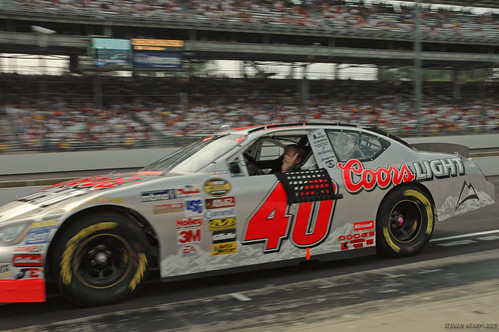
No, it's not Sterling Marlin in the Coors car, but rather Carl Edwards' paint scheme for this weekend's race in Chicago. Great use of the annoying Aflac spokesduck on the side of the car, especially with the black stroke to set it off from the silver body. This baby should sparkle under the Saturday night lights. And for the sake of one Duckpin dad, let's hope Carl does, too.

Wednesday, July 8, 2009

Is Everything OK?

According to Amos Kennedy it is. His swell chipboard letterpress poster is available from the Everything is Okay shop. If I had his printing skills, everything would be okay.

Sunday, July 5, 2009

Dave Churchman's House o' Letterpress, Now With Photos!

Photos from our pilgrimmage to Dave and Charlene Churchman's Boutique de Junque...

...the wood type (and other stuff) room


...piles upon piles of type


...and dingbats, too


...assorted nuts and cuts


...factions of fractions


...in short, everything you could want. (Unless you happen to be the Indianapolis fire marshal.)

Thursday, July 2, 2009

Beers and Cheers

What better way to celebrate life, liberty, and the pursuit of mullets than a can of Dale's Pale Ale? Happy Independence Day, everyone. Crack open a Dale's and enjoy a celebration of the intersection of design and beer:

Design O'Blog brings you the 20 best examples of beer packaging, including six packs, four packs, and yes, the one pack. Ever wonder what it takes to design that kick-ass beer packaging? This case study is broken down and generously illustrated. Perhaps you're wondering where you can sample some superlative suds? Take a gander at an atlas of award-winning beers, a tasty little infographic. And finally, do you like the scripty typeface in the art above? It's a font influenced by beer labeling, rightly named "Draft Beer Classic" and available for the price of a case of Natty Boh.

Happy birthday, America!


Bonus: from fringe of beer-related design...
Beer pong tables... and lots of 'em.
Listen to the can as you run to the can. What to do with your empties.

Tuesday, June 30, 2009

Dave Churchman's House o' Letterpress

Fresh back from Indianapolis with a pile of letterpress supplies. We loaded up with a couple cases of lead type (36pt Airport and 36pt P.T. Barnum); 2 fonts of wood type (8 line Futura and 8 line French Clarendon Condensed), both all caps with figures; various cuts and tons of dingbats; a furniture cabinet; paper, tympan, pressboard, and a few blank type cases for the cabinet*. More pics of Dave's place in a later post. For now, onto finding a home for the new arrivals!

* This leaves us with a surplus of type cases (the divided drawers used for holding type). If you are interested in them, let us know.

Monday, June 29, 2009

APA preview: Trees are our friends

A pearl of wisdom from the master of the fanbrush.

Paper is Crane Lettra (110#, pearl white); type is handset lead; image is lino cut; 3.67" x 4.25"

Saturday, June 27, 2009

Shop Music: Johnny Cash

This series celebrates what we're playing while we're printing.

You pretty much can't go wrong with any offering from Johnny Cash, but our current favorite is American III: Solitary Man. Recorded after his health started to wane, Solitary Man offers sparse and tender performances by Cash. On each track he confronts his physical frailty with an enduring resilience, producing an rather inspiring album. A highlight for us is June Carter Cash joining him for a beautiful rendition of "Field of Diamonds." It's a nice bookend to their earlier animated collaborations such as "Jackson," and a gleaming reminder of the inevitable passage of time.

Samples can be heard here.

Friday, June 26, 2009

Road Trip

Duckpin is off to see Dave Churchman in Indianapolis this weekend. Hopefully the Beetle will be pushing its way back on I-70 overflowing with all sorts of letterpress goodies.

Wednesday, June 24, 2009

APA June Bundle, part 2


A good letterpress shop has a small selection of fancy initial caps to choose from when setting text. By this measure, Arlene Popkin and Stephen Hirshberg's Thomas Jefferson Press is a great shop. Their offering in the June APA bundle showcases 26 different decorative capitals, from A to Z. Each capital kicks off a passage from a famous literary work, so not only is their booklet a pleasure for the eyes, but it provides satisfaction for the soul. Above is the cover and two examples of the beautifully set pages, with excerpts from Ulysses (S) and Zip-A-Dee-Doo-Dah (Z).

Printed on a 1908 7x11 Golding Improved Pearl. Edition: 200.

Sunday, June 21, 2009

APA June Bundle, part 1

Couple of nice pieces in the June APA bundle. The wedding invite on the left features almost a dozen different fonts. What could be a design disaster in the making instead is deftly executed, as the fonts hang together in a surprisingly cohesive way. The monochromatic printing no doubt helps this, but you gotta appreciate the risk taken in using such a wide array of faces and making it work. All in all a fun little invite.

On the right is a rather simple one-color bookmark from Gary Hidden that makes great use of a tropical cut. The elongated palm tree scene feels right at home on the 7 inch tall bright-orange paper -- perfect for finding what page you left off on. It will be finding a home in my summer reading: The Dord, the Diglot, and an Avocado or Two: The Hidden Lives and Strange Origins of Common and Not-So-Common Words.

Thursday, June 18, 2009

Type

Web Urbanist is a great site devoted to exploring art, architecture, and design. They occasionally dip into graphic design, including this post devoted to modern typographic art. Above is a design by Steve Yee of Chiat/Day. Radiohead fans will recognize the words as song titles favored by Thom Yorke, who is pictured. There are 14 more pieces of equally impressive type design in the post.